Qu'on is a brand born in the world without being based on a space or location.
The brand is for a sophisticated and stylish target, that recognizes originality and uniqness. The logo is the outward expression of the brand.
The brand is for a sophisticated and stylish target, that recognizes originality and uniqness. The logo is the outward expression of the brand.
Opportunity
Olhamar is a 40 years old specialized factory for fashion accessories.
In the recent years, the fashion accessories are associated with brands of clothing. Those brands have expanded their portfolio to accessories, fragrances and other products to expand their image, their target and their profit. We are witnessing a big increase of the accessories search as a style statement. The indiviaduality afirmation and the customization of the look became more relevant than the "full brand look". The fashion accessories play a role as much as important as the clothing. Each season every designer and brands come up with a top of must haves.
The opportunity arises from the idea of creating a new brand that provides accessories that will enrich and personalize the look of a stylish target that cares about uniqueness.
Briefing
Create a new accessories brand with an international look and profile with a strong perception of quality - manufacturing experienced.
– To build a consistent and solid positioning that can be extendend on other products by cross selling accessories.
– To creat a consistent brand universe beggining with the name, and expanding it to identity, packaging,
label, product visibility.
– Take the brand to a level of excellence in order to get the client interest, either on the verbal or visual expression of the brand.
Naming & Signature
Qu’on around you.
The intention was to creat a unique and original name. Qu’on is an abstract and universal name for a new
world. Above the style, taste and trend Qu’on completes the look and is around us as an accessorise that completes us.
The intention was to creat a unique and original name. Qu’on is an abstract and universal name for a new
world. Above the style, taste and trend Qu’on completes the look and is around us as an accessorise that completes us.
Inspiration
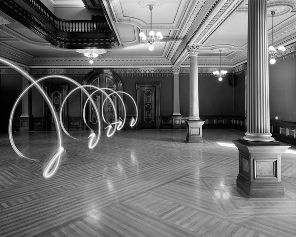
A simple gesture as a brand expression. Volume and material. Personality. Japan inspiration.
Concept
Draw the logo with fluid and organic elements that mimic the movements of the materials they are made of. Creating a visual and intelligible universe with a density of elements that give life and meaning to our everyday life. Elements that compose our look.

Identity
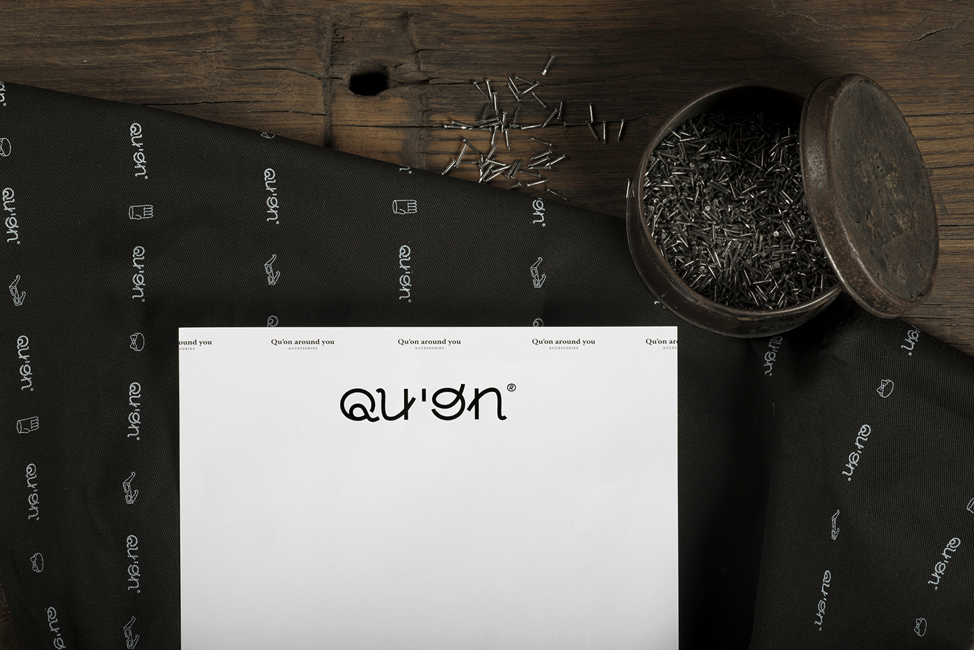
Qu'on is a brand for the world. With that spirit we developed the graphic universe for the brand. Our reference is based on the material (leather, rope, fabric) and its versatility, fluidity and forms, thats how we defined the brand language.
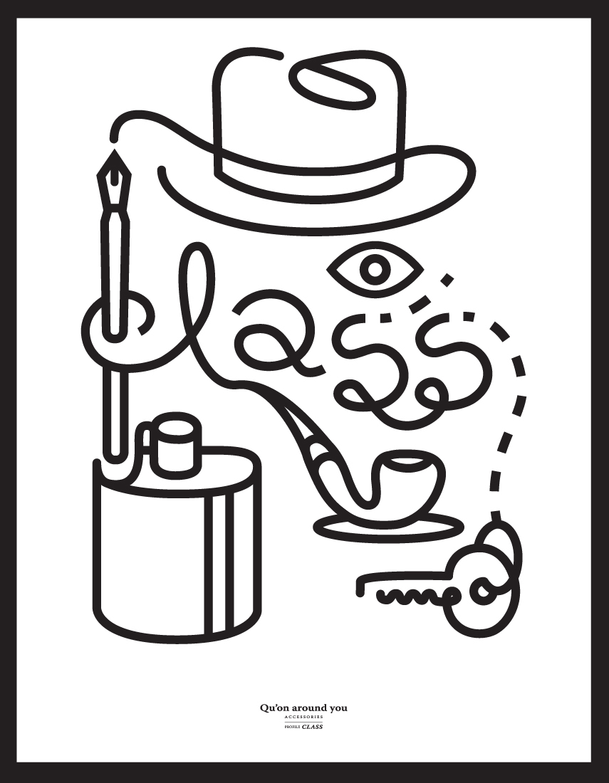
Qu'on type, a typography exclusively designed for the project, is defined by volumetry as a visual extension of accessories usage. The inspiration come from Japan (relevant market for the brand) and resulted as a gestural expression, which reinforces the non-verbal brand. We also designed an extensive library of icons (60) hat gives continuity to a system of visual objects / around us. Our look is defined by the objects found in our suitcases, which actually define who we are.
Qu'on is a brand for the world. With that spirit we developed the graphic universe for the brand. Our reference is based on the material (leather, rope, fabric) and its versatility, fluidity and forms, thats how we defined the brand language.
Qu'on type, a typography exclusively designed for the project, is defined by volumetry as a visual extension of accessories usage. The inspiration come from Japan (relevant market for the brand) and resulted as a gestural expression, which reinforces the non-verbal brand. We also designed an extensive library of icons (60) hat gives continuity to a system of visual objects / around us. Our look is defined by the objects found in our suitcases, which actually define who we are.


Site
http://www.quon.eu/
Photography © Nuno Moreira / NUMO
Thx to:
João Ramalho, Lina Ramalho, Magda Mendes, António Pinho, Hugo Marques, Pedro Caria, Daniela Fardilha, Telmo Parreira, Joana Bravo, Wiola Stankiewicz.
Follow the studio daily life in instagram @thisipacifica
Follow the studio daily life in instagram @thisipacifica


